Numéro

Numéro is an international fashion magazine. It has a circulation of 80,000 and the French edition reached its 100th issue in February 2009. The magazine covers international fashion, beauty, design, health, architecture and decor, as well as spreads on trendsetting celebrities.

It was founded in 1998 by Elisabeth Djian. When asked why she created Numéro, she commented, “I was bored with magazines that told me how to seduce a man. I wanted to create this magazine for an intelligent, smart woman who wants to read about art, design, music: not about stupidity – creams that take away wrinkles, you know, which is stupid.”

Numéro Homme launched in 2007 which is a separate biannual magazine for men, focusing on lifestyle.

Above are some of my favourite past Numero covers. I love how strong in each of the images the female model looks. I particularly like the pose on the 4th cover, the angle of the photo, the shadow and how the model looks natural. I may trial some natural photos like this. In the 2nd the contrast between the models pale skin tone and dark background is really interesting and creates a story.

Sum Zine

‘Sum Zine is a biannual slow-fashion magazine based out of NYC. Everything adds up in the way that we consume. Its mission was to open up the dialogue about changing the industry for the better. Talk more, waste less.’

The magazine was founded in Fall 2013, with three print releases between 2014 and 2015. The magazine celebrated crowded launch parties, a photography exhibition, a six-week gallery installation at Seaport Studios, and a lively creative community of photographers, artists, stylists, beauty artists, designers, and writers. However in January 2016 it was released that it was on an indefinite hiatus.

Sum Zine have additionally sold posters and postcards. They are available to reach on social media like Facebook, Twitter, Tumblr and Instagram.

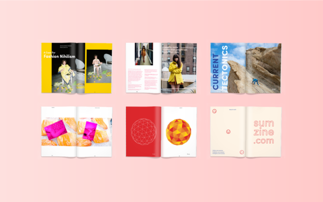
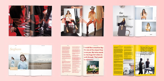
The bright, bold colours used within the magazine is something that caught my attention as well as many of their readers. As shown below the uniqueness and creativity of the magazine spreads are fun and interesting which is something I would like to achieve from my final image. I particularly like the placing of images, and the use of different coloured fonts and sizes.

sumzine_mockups-10sumzine2

Issue 3 focusing and targeting upon sustainability, very current topic.

Sumzine was and is currently stocked worldwide. Photographers featured within the magazine include; Emma Anderson, Regine David, Adam Katz Sinding, Myla DalBesio, Lena Shkoda, Nekole Kemelle, Shanita Sims, Jayne Lies, Katie Miller, Brayden Olson, Mae Richards, and Sharokh Mirzai

I really liked some of the images I have seen in the magazine so will look into some of the photographers above to gather inspiration for my shoot

Zara: Gender Neutrality

Within the industry Zara are known for their short lead times and fast turnaround from design to production, in order to deliver the latest trends to the customer.

The concept of Unisex clothing has been growing for the past couple of years, with brands such as Toogood gaining popularity. The last few months have seen fashion houses such as Burberry announce the merging of their mens & womens line shows.

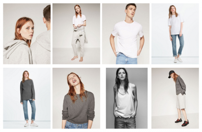
ungendered-Zara-e1457359163191

The collection currently consists of eight pieces; plain T-shirts, hoodies, jeans and the like in grey, white and navy. So far, so simple.

As this is a growing trend, I am looking to explore this in more depth as I think it is a relevant topic for current magazines that would interest a lot of readers.

For instance I am thinking of dressing my model in slightly more masculine clothes to give this look.

Huck Magazine

From the beginning of the project I had always been interested in producing a front cover or magazine, this was as a result of looking at independent publications compared to the more iconic magazines. I felt as though more unique ideas would suit the independent publications rather than magazines like Harper’s Bazaar and Vogue, which typically just have the face or upper body of the model on the front cover. Which gives less room for editing and shooting in an interesting background, therefore I am researching into more depth some of the independent magazines I liked to learn more about the content, style of images and reader.

The first magazine I am looking into is Huck, which I flicked through when in Ideas on Paper.

page_1

Huck celebrates independent culture – people and movements that paddle against the flow. Inspired by DIY principles. Each issue contains a wide range of articles from surfing and snowboarding to travel, art, film and fashion.

I particularly like the cover above with the model in the centre in focus and the background blurred out it almost makes the image look 3D. The bright colours are also very effective.

However when looking into Huck in more detail a lot of the images on the covers and inside were more landscapes and groups of people which does not fit the brief so well. Additionally not very many of the articles were actually based on fashion so I have decided not to go forward with this magazine

None the less one thing I did like about the magazine is the use of white space around the images within the magazine. I felt this gave a very professional but quirky look which is something I will think about doing if I choose to do a double page spread.

Upcoming Photographers

I have chosen to research into a few new, not so known photographers to gather new original ideas for my final image. In addition to looking at big professional photographers this may inspire me for different more ‘unseen’ ideas which are not as often seen in magazines.

Bobby Doherty:

Bobby Doherty exhibits a range of vibrant compositions that’s super fun, pop, and engaging, usually with an eye for graphic design. The bright colours of Doherty’s work definitely catches the eye and I can see images like the ones above being used in a number of magazines.

Ira Chernova:

Ira Chernova has been floating around the Internet with captions like “Who is this girl?” Chernova is a young photographer living in Moscow. Her work brings dark, dreamlike brilliance to raw New York City portraits giving a sense of mystery making the viewer think about the images. I particularly like the ‘darkness’ of her photos, it definitely draws attention and makes the reader look twice.

Clement Pascal:

I especially like the earth tones and natural lighting of Pascals work which are his signature style. I think they work very well being simple but effective.


Mert and Marcus

Mert and Marcus is the working name of two fashion photographers (Mert Alaş and Marcus Piggott) who work together on a collaborative basis. Their work and style is influenced by the photographer Guy Bourdin and have pioneered the use of digital manipulation within their field. They were both born in 1971.

Mert Alaş, born in Turkey and Marcus Piggott, born in Wales, met in England in 1994 after having worked for a brief period in different areas, Alaş in classical music and Piggott in graphic design. Piggott was an assistant photographer and Alas was a fashion photo modeler. After working together in the photography business, they decided to create a team. 

They are known for their portraits of sophisticated, powerful women: “The difference between us and other photographers is that we care a lot about appearance,” says Alaş. “We spend most of the time in the make-up and hairstyling rooms”.

The team now works for such magazines such as Vogue USA, Vogue Paris, Vogue Italia, The Love Magazine, W Magazine, Pop Magazine, Numéro and Arena Homme Plus.Some of their major clients are fashion labels such as Dior, Louis Vuitton, Missoni, Giorgio Armani, Roberto Cavalli, Fendi, Kenzo and Miu Miu.

Horst

In the history of twentieth-century fashion and portrait photography, Horst’s contribution figures as one of the most artistically significant and long lasting, spanning as it did the sixty years between 1931 and 1991. During this period, his name became legendary as a one-word photographic byline, and his photographs came to be seen as synonymous with the creation of images of elegance, style and rarefied glamour.

Born on 14 August 1906, Horst Paul Albert Bohrmann was the second son of a prosperous middle class Protestant shop owner, Max Bohrmann and his wife, Klara Schoenbrodt.

I have chosen to research into Horst as I had visited the exhibition in the Victoria and Albert Museum and thoroughly enjoyed it.

Horst’s work from the 1930s and 40s were very interesting. His work adapted quickly to a new visual vocabulary, creating some of Vogue’s most dazzling colour images. In 1935 he photographed the Russian Princess Nadejda Sherbatow in a red velveteen jacket for the first of his many Vogue cover pictures.

Horst’s colour photographs are rarely exhibited because few vintage prints exist. Colour capture took place on a transparency which could be reproduced on the magazine page without the need to create a photographic print. The size of the new prints displayed in this room of the exhibition echoes the large scale of a group of Horst images printed in 1938 at the Condé Nast press.

http://www.vam.ac.uk/content/exhibitions/exhibition-horst-photographer-of-style/about-the-exhibition/

http://www.horstphorst.com/abouthorst.php

Initial Research

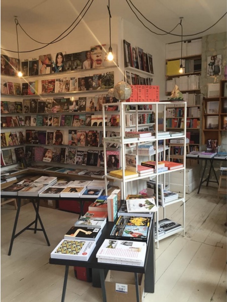
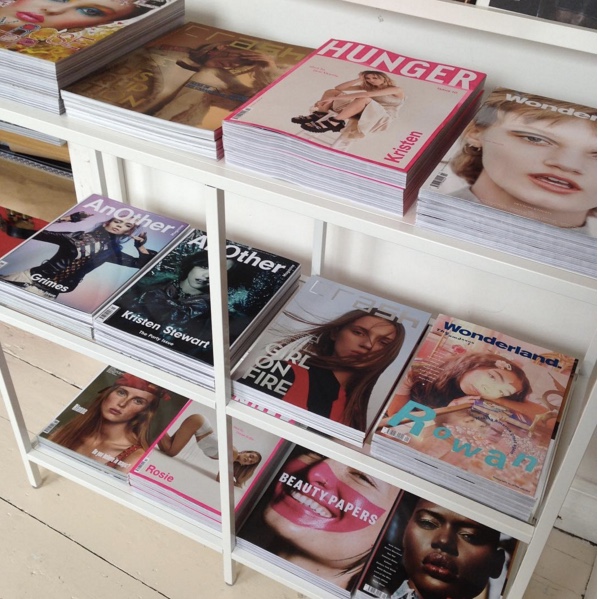
To get started on choosing the perfect magazine I visited Ideas on Paper in Hockley. It is an independent newsagent located which holds and sells a range of magazines, journals and books as well as stationary.

Ideas on paper provoke and collect a selection of independent titles on fashion, art, culture, design, business, economics, food and travel.

During my trip I looked and studied the magazines within the shop including ones I hadn’t even heard of.

Some of the magazines I am particularly interested in for the project are Huck, Twin, Heroine and Oh comely which I will have research further into as well as other magazines.

Screen Shot 2016-05-02 at 20.02.16Screen Shot 2016-05-02 at 20.02.39Screen Shot 2016-05-02 at 20.02.45